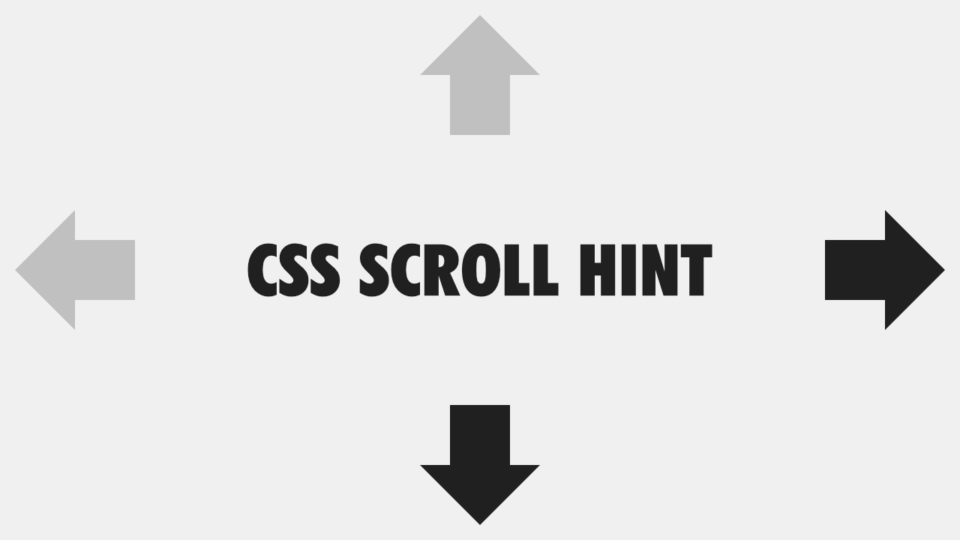
CSSのみで実装するテーブル用スクロールヒント
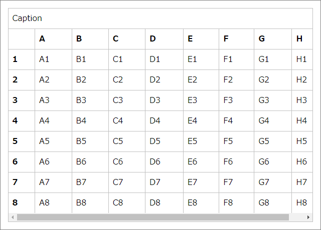
テーブル (表) をスマホなどの小さい画面で表示させた場合に、テーブルセルが小さくなりすぎたり、内容が溢れてしまうのを防ぐため、スクロールできるようにするのが一般的だと思います。
しかし、スクロールバーが表示されない環境では、スクロールできるどうかが分かりづらい場合があります。
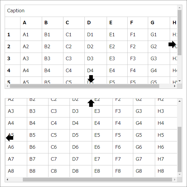
そこで今回は、スクロールできることを明示する「スクロールヒント」を CSS のみで実装する方法を紹介します。
使用する animation-timeline プロパティについて
今回作るスクロールヒントは、Chrome 系のブラウザに先行実装されている animation-timeline プロパティを使用します。2024年5月現在、Safari と FireFox はこのプロパティをまだ実装していません。
CSS アニメーション (@keyframes) は通常、animation-duration プロパティなどで設定された時間によって進行しますが、この animation-timeline プロパティを使用することで、スクロール量によって進行する CSS アニメーションを作ることができます。
スクロールが発生していない場合や、animation-timeline プロパティが実装されていないブラウザでは、CSS アニメーションが適用されません。
テーブルの HTML コード
<div class="__table__">
  <table>
    <caption>表題</caption>
    <colgroup> … </colgroup>
    <thead> … </thead>
    <tbody> … </tbody>
  </table>
</div>
table 要素を div 要素で囲んだシンプルな構造です。table 要素内の構成は自由ですが、表題をスクロールさせたくない場合には、caption 要素を使用せず、figure 要素と figcaption 要素を組み合わせた方がいいでしょう。
<figure>
  <figcaption>表題</figcaption>
  <div class="__table__">
    <table>
      <colgroup> … </colgroup>
      <thead> … </thead>
      <tbody> … </tbody>
    </table>
  </div>
</figure>
テーブルの基本的な CSS コード
[class*="__table__"] {
  & {
    --border-style: solid;
    --border-width: 1px;
    --border-color: #c0c0c0;
    --padding: 0.5rem;
    border: var(--border-style) var(--border-width) var(--border-color);
    max-block-size: 75dvb;
    overflow: auto;
  }
  & table {
    --inline-size: 40rem;
    --table-layout: auto;
    border: hidden;
    border-collapse: collapse;
    inline-size: var(--inline-size);
    min-inline-size: 100%;
    table-layout: var(--table-layout);
  }
  & caption {
    border-block-end: var(--border-style) var(--border-width) var(--border-color);
    padding: var(--padding);
    text-align: inherit;
  }
  & col {
    --inline-size: auto;
    inline-size: var(--inline-size);
  }
  & :is(td,th) {
    border: var(--border-style) var(--border-width) var(--border-color);
    padding: var(--padding);
    text-align: inherit;
  }
}
.__table__diagonal-line :is(td,th):empty { /* 空のテーブルセルに斜線を入れるオプション */
  background-image: linear-gradient(to left bottom,transparent calc(50% - 0.75px),var(--border-color) calc(50% - 0.25px) calc(50% + 0.25px),transparent calc(50% + 0.75px));
}
これといった特徴のない、レスポンシブなテーブルです。複数の箇所で共通する値は、CSS 変数にしておくと便利です。
横スクロールバーが画面外になるほど縦に長くなった要素は、横スクロールさせにくくなるので、max-block-size プロパティを設定しています。
また、オプションとなる class 属性値や、style 属性に記述した CSS 変数で CSS コード内の CSS 変数を上書きできるようにしておくと、汎用的に使い回せるテーブルになります。
<div class="__table__diagonal-line">
  <table style="--inline-size: 60rem; --table-layout: fixed;">
    <colgroup>
      <col style="--inline-size: 5rem;" />
      <col />
      <col />
      <col />
    </colgroup>
    …
  </table>
</div>
スクロールヒントの CSS コード
スクロールヒントは正方形の ::before 擬似要素と ::after 擬似要素を、clip-path プロパティで矢印の形に切り抜いて表示させます。これらは table 要素の上に重なるように表示させるため、グリッドでレイアウトしていきます。
[class*="__table__"] {
  & {

    /* CSS アニメーションで変化させる CSS 変数の初期値 */
    --before_clip-path: inset(50%);
    --before_inset-block: auto 0;
    --before_place-self: end auto;
    --after_clip-path: inset(50%);
    --after_inset-inline: auto 0;
    --after_place-self: auto end;

    display: grid;
      grid: auto / 100% auto;
  }
  &::before { /* ブロック方向のスクロールヒント */
    background: currentcolor;
    block-size: 2rem;
    clip-path: var(--before_clip-path);
    content: "";
    grid-area: 1 / 1 / 2 / 2;
      place-self: var(--before_place-self);
    inline-size: 2rem;
    position: sticky;
      inset-block: var(--before_inset-block);
      inset-inline: calc(50% - 1rem);
    z-index: 1;
  }
  &::after { /* インライン方向のスクロールヒント */
    background: currentcolor;
    block-size: 2rem;
    clip-path: var(--after_clip-path);
    content: "";
    grid-area: 1 / 1 / 2 / 3;
      place-self: var(--after_place-self);
    inline-size: 2rem;
    position: sticky;
      inset-block: calc(50% - 1rem);
      inset-inline: var(--after_inset-inline);
    z-index: 1;
  }
  &:dir(rtl)::after { /* 書字方向が右から左の場合はスクロールヒントを反転 */
    rotate: y 180deg;
  }
  & table {
    grid-area: 1 / 1 / 2 / 3;
  }
}
この CSS コードによって、垂直方向のスクロールヒントはテーブル下部の中央に、水平方向のスクロールヒントはテーブル右側の中央に固定配置されるようになります。しかし、CSS アニメーションが適用されない限り、clip-path: inset(50%); の設定によってスクロールヒントは表示されません。
次に CSS アニメーションに関する部分です。
@keyframes block-scroll-hint {
  0% {
    --before_clip-path: polygon(50% 90%,10% 50%,30% 50%,30% 10%,70% 10%,70% 50%,90% 50%); /* 下向き矢印 */
    --before_inset-block: auto 0;
    --before_place-self: end auto;
  }
  25%, 75% { /* 矢印が表示されないスクロール量 */
    --before_clip-path: inset(50%);
  }
  100% {
    --before_clip-path: polygon(50% 10%,90% 50%,70% 50%,70% 90%,30% 90%,30% 50%,10% 50%); /* 上向き矢印 */
    --before_inset-block: 0 auto;
    --before_place-self: start auto;
  }
}
@keyframes inline-scroll-hint {
  0% {
    --after_clip-path: polygon(90% 50%,50% 90%,50% 70%,10% 70%,10% 30%,50% 30%,50% 10%); /* 右向き矢印 */
    --after_inset-inline: auto 0;
    --after_place-self: auto end;
  }
  25%, 75% { /* 矢印が表示されないスクロール量 */
    --after_clip-path: inset(50%);
  }
  100% {
    --after_clip-path: polygon(10% 50%,50% 10%,50% 30%,90% 30%,90% 70%,50% 70%,50% 90%); /* 左向き矢印 */
    --after_inset-inline: 0 auto;
    --after_place-self: auto start;
  }
}
[class*="__table__"] {
  & {

    /* CSS アニメーションで変化させる CSS 変数の初期値 */
    --before_clip-path: inset(50%);
    --before_inset-block: auto 0;
    --before_place-self: end auto;
    --after_clip-path: inset(50%);
    --after_inset-inline: auto 0;
    --after_place-self: auto end;

    animation: block-scroll-hint, inline-scroll-hint;
    animation-timeline: scroll(block self), scroll(inline self);
  }
}
animation-timeline プロパティが実装されているブラウザでスクロールが発生すると、CSS 変数の初期値が CSS アニメーションに設定した CSS 変数の値に上書きされます。
これにより、下方向にスクロールできるときは、テーブル下部の中央に下向き矢印が、上方向にスクロールできるときは、テーブル上部の中央に上向き矢印が表示されます。
同様に、右方向にスクロールできるときは、テーブル右側の中央に右向き矢印が、左方向にスクロールできるときは、テーブル左側の中央に左向き矢印が表示されます。
ひとまとめにした CSS コード
「テーブルの基本的な CSS コード」と「スクロールヒントの CSS コード」をひとまとめにすると次のようになります。コピペして使ってみてください。
@keyframes block-scroll-hint {
  0% {
    --before_clip-path: polygon(50% 90%,10% 50%,30% 50%,30% 10%,70% 10%,70% 50%,90% 50%);
    --before_inset-block: auto 0;
    --before_place-self: end auto;
  }
  25%, 75% {
    --before_clip-path: inset(50%);
  }
  100% {
    --before_clip-path: polygon(50% 10%,90% 50%,70% 50%,70% 90%,30% 90%,30% 50%,10% 50%);
    --before_inset-block: 0 auto;
    --before_place-self: start auto;
  }
}
@keyframes inline-scroll-hint {
  0% {
    --after_clip-path: polygon(90% 50%,50% 90%,50% 70%,10% 70%,10% 30%,50% 30%,50% 10%);
    --after_inset-inline: auto 0;
    --after_place-self: auto end;
  }
  25%, 75% {
    --after_clip-path: inset(50%);
  }
  100% {
    --after_clip-path: polygon(10% 50%,50% 10%,50% 30%,90% 30%,90% 70%,50% 70%,50% 90%);
    --after_inset-inline: 0 auto;
    --after_place-self: auto start;
  }
}
[class*="__table__"] {
  & {
    --before_clip-path: inset(50%);
    --before_inset-block: auto 0;
    --before_place-self: end auto;
    --after_clip-path: inset(50%);
    --after_inset-inline: auto 0;
    --after_place-self: auto end;
    --border-style: solid;
    --border-width: 1px;
    --border-color: #c0c0c0;
    --padding: 0.5rem;
    animation: block-scroll-hint, inline-scroll-hint;
    animation-timeline: scroll(block self), scroll(inline self);
    border: var(--border-style) var(--border-width) var(--border-color);
    display: grid;
      grid: auto / 100% auto;
    max-block-size: 75dvb;
    overflow: auto;
  }
  &::before {
    background: currentcolor;
    block-size: 2rem;
    clip-path: var(--before_clip-path);
    content: "";
    grid-area: 1 / 1 / 2 / 2;
      place-self: var(--before_place-self);
    inline-size: 2rem;
    position: sticky;
      inset-block: var(--before_inset-block);
      inset-inline: calc(50% - 1rem);
    z-index: 1;
  }
  &::after {
    background: currentcolor;
    block-size: 2rem;
    clip-path: var(--after_clip-path);
    content: "";
    grid-area: 1 / 1 / 2 / 3;
      place-self: var(--after_place-self);
    inline-size: 2rem;
    position: sticky;
      inset-block: calc(50% - 1rem);
      inset-inline: var(--after_inset-inline);
    z-index: 1;
  }
  &:dir(rtl)::after {
    rotate: y 180deg;
  }
  & table {
    --inline-size: 40rem;
    --table-layout: auto;
    border: hidden;
    border-collapse: collapse;
    grid-area: 1 / 1 / 2 / 3;
    inline-size: var(--inline-size);
    min-inline-size: 100%;
    table-layout: var(--table-layout);
  }
  & caption {
    border-block-end: var(--border-style) var(--border-width) var(--border-color);
    padding: var(--padding);
    text-align: inherit;
  }
  & col {
    --inline-size: auto;
    inline-size: var(--inline-size);
  }
  & :is(td,th) {
    border: var(--border-style) var(--border-width) var(--border-color);
    padding: var(--padding);
    text-align: inherit;
  }
}
.__table__diagonal-line :is(td,th):empty {
  background-image: linear-gradient(to left bottom,transparent calc(50% - 0.75px),var(--border-color) calc(50% - 0.25px) calc(50% + 0.25px),transparent calc(50% + 0.75px));
}
CodePen
〆
Safari や FireFox も早く animation-timeline プロパティを実装して欲しいです。
関連記事
- [CSS] 全ブラウザでサポートされた:has擬似クラスの使い方
 2023年12月19日の FireFox のアップデートにより、全ブラウザでサポートされるようになったCSSの:has擬似クラス。この:has擬似クラスの革命的な理由を解説すると共に、その使い方も紹介しています。
 - CSSのbox-sizingにはないmargin-boxを疑似的に再現する小技
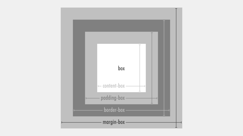 box-sizingプロパティで設定できない、というより存在すらしていない、margin-boxを疑似的に再現する方法を紹介しています。widthプロパティとmarginプロパティの設定が上手くいかないような場合に役に立つかもしれません。
 - レンダリングを妨げるリソースの除外でPageSpeed改善2019
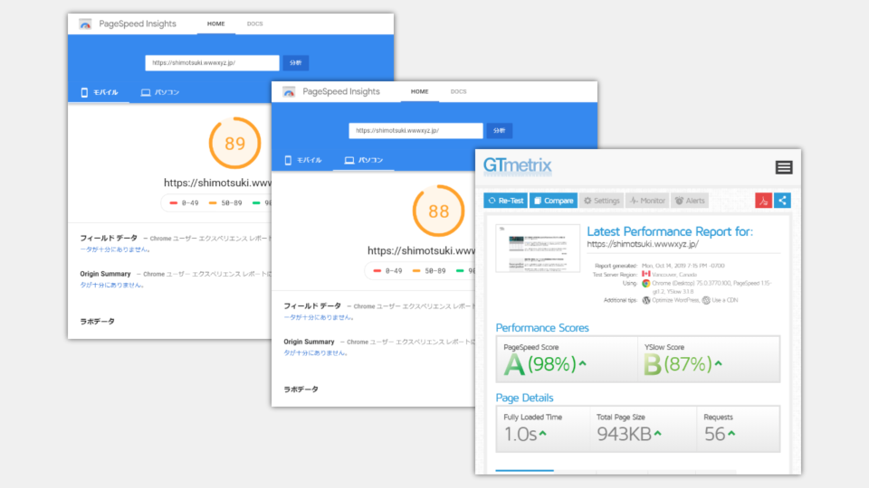 PageSpeed Insights の診断で「レンダリングを妨げるリソースの除外」という項目に引っ掛かった場合に、HTMLにいくつかのコードを追加するだけで、ウェブページの読み込み時間 (表示速度) が改善できるpreload (先読み) について紹介しています。
 - AIO/LLMOで差をつける「XHTMLの理念」
 Web上で注目されている AIO や LLMO でライバルに差をつけるための「XHTMLの理念」について解説します。