グラフをHTMLとCSSで作るならtable要素が最適解かもしれない
円グラフや棒グラフをウェブページに載せる際、皆さんはどうしていますか?
Photoshop などで画像として作り、img要素で表示しますか? それとも、SVG で作りますか? あるいは、canvas要素と JavaScript を組み合わせて描画しますか?
様々な方法が考えられますが、セマンティックに、かつ手軽に作りたいのであれば、table要素を CSS でスタイリングする方法がベストかもしれません。
table要素で円グラフを作る方法
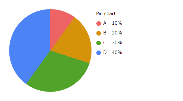
円グラフの HTML は次のようになります。
<table class="_pie-chart" style="--pie-size: 50%;">
  <caption>Pie chart</caption>
  <tbody>
    <tr style="--piece-start: 0; --piece-end: 10; --piece-color: var(--red);">
      <th scope="row">A</th>
      <td>10%</td>
    </tr>
    <tr style="--piece-start: 10; --piece-end: 30; --piece-color: var(--yellow);">
      <th scope="row">B</th>
      <td>20%</td>
    </tr>
    <tr style="--piece-start: 30; --piece-end: 60; --piece-color: var(--green);">
      <th scope="row">C</th>
      <td>30%</td>
    </tr>
    <tr style="--piece-start: 60; --piece-end: 100; --piece-color: var(--blue);">
      <th scope="row">D</th>
      <td>40%</td>
    </tr>
  </tbody>
</table>
--pie-size で円グラフの大きさ、--piece-color で項目の色を設定します。円グラフの扇状の開始位置のパーセンテージを --piece-start、終了位置のパーセンテージを --piece-end で設定します。
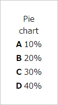
ちなみに HTML のみだと次のように表示されます。
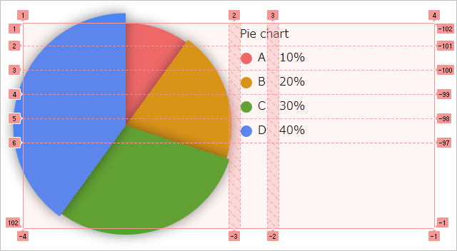
このtable要素に、次のような CSS を設定することで円グラフになります。
html {
  & {
    --red: #ee6363;
    --yellow: #d5920b;
    --green: #52a329;
    --blue: #4c84f6;
    --gray: #888;
    --black: #101010;
    --white: #fff;
    --borw: var(--black);
    --worb: var(--white);
  }
  @media (prefers-color-scheme: dark) {
    & {
      --borw: var(--white);
      --worb: var(--black);
    }
  }
}
table._pie-chart {
  & {
    --pie-size: 50%;
    --piece-start: 0;
    --piece-end: 0;
    --piece-color: var(--borw);
    display: grid;
      grid: repeat(100, auto) 1fr / var(--pie-size) auto minmax(auto, 1fr);
      column-gap: 1rem;
  }
  & caption {
    display: block;
    grid-column: 2 / 4;
    text-align: inherit;
  }
  & :is(tbody, tr) {
    display: contents;
  }
  & tr::before {
    aspect-ratio: 1 / 1;
    background: conic-gradient(
      transparent calc(1% * var(--piece-start)),
      var(--piece-color) calc(1% * var(--piece-start)) calc(1% * var(--piece-end)),
      transparent calc(1% * var(--piece-end))
    );
    border-radius: 50%;
    content: "";
    display: block;
    grid-area: 1 / 1 / -1 / 2;
      align-self: center;
  }
  & th {
    display: block;
    font-weight: inherit;
    grid-column: 2;
    text-align: inherit;
  }
  & th::before {
    aspect-ratio: 1 / 1;
    background: var(--piece-color);
    border-radius: 50%;
    content: "";
    display: inline-block;
    inline-size: 1em;
    margin-inline-end: 0.5em;
    vertical-align: middle;
  }
  & td {
    display: block;
    grid-column: 3;
  }
}各要素はグリッドレイアウトで配置しています。円グラフはtr要素に設定した::before擬似要素に、background: conic-gradient(); を組み合わせ、レイヤーのように重ねて表示しています。
table要素で棒グラフを作る方法
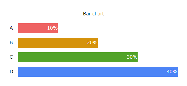
棒グラフの HTML は次のようになります。
<table class="_bar-chart" style="--bar-max: 40;">
  <caption>Bar chart</caption>
  <tbody>
    <tr>
      <th scope="row">A</th>
      <td style="--bar-value: 10; --bar-color: var(--red);">10%</td>
    </tr>
    <tr>
      <th scope="row">B</th>
      <td style="--bar-value: 20; --bar-color: var(--yellow);">20%</td>
    </tr>
    <tr>
      <th scope="row">C</th>
      <td style="--bar-value: 30; --bar-color: var(--green);">30%</td>
    </tr>
    <tr>
      <th scope="row">D</th>
      <td style="--bar-value: 40; --bar-color: var(--blue);">40%</td>
    </tr>
  </tbody>
</table>
--bar-max で最大値、--bar-value で最大値に対する割合、--bar-color で棒の色を設定します。
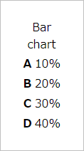
ちなみに HTML のみだと次のように表示されます。
このtable要素に、次のような CSS を設定することで棒グラフになります。
html {
& {
--red: #ee6363;
--yellow: #d5920b;
--green: #52a329;
--blue: #4c84f6;
--gray: #888;
--black: #101010;
--white: #fff;
--borw: var(--black);
--worb: var(--white);
}
@media (prefers-color-scheme: dark) {
& {
--borw: var(--white);
--worb: var(--black);
}
}
}
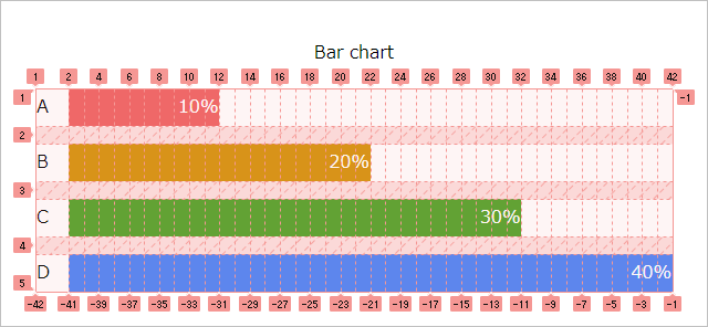
table._bar-chart {
& {
--bar-max: 100;
--bar-value: 10;
--bar-color: var(--borw);
display: block;
}
& > * + * {
margin-block-start: 1rem;
}
& :is(caption, thead) {
display: block;
inline-size: fit-content;
margin-inline: auto;
text-align: inherit;
}
& thead tr {
display: flex;
flex-flow: wrap;
column-gap: 1rem;
}
& thead th {
display: block;
font-weight: inherit;
text-align: inherit;
}
& thead th::before {
aspect-ratio: 1 / 1;
background: var(--bar-color);
border-radius: 50%;
content: "";
display: inline-block;
inline-size: 1em;
margin-inline-end: 0.5em;
vertical-align: middle;
}
& tbody {
display: grid;
grid: none / auto repeat(var(--bar-max), 1fr);
row-gap: 1rem;
}
& tbody tr {
display: grid;
grid: repeat(100, auto) 1fr / subgrid;
grid-column: 1 / -1;
}
& tbody th {
display: block;
font-weight: inherit;
grid-row: 1 / -1;
align-self: center;
margin-inline-end: 1rem;
text-align: inherit;
}
& tbody td {
background: var(--bar-color);
color: var(--worb);
display: block;
grid-column-end: span var(--bar-value);
overflow: hidden;
padding-inline: 1px;
text-align: end;
text-overflow: ellipsis;
white-space: nowrap;
}
& tr > :is(:empty, [style*="--bar-value: 0;"]) {
clip-path: inset(50%);
position: absolute;
}
&:where(.grouped) {
& tbody td {
grid-column-start: 2;
}
& tbody td + * {
margin-block-start: 1px;
}
}
}棒グラフの棒の部分はグリッドレイアウトで配置しています。tbody要素に設定した repeat(var(--bar-max), 1fr) で見えない目盛りとしてのグリッドトラックを作り、td要素に設定した grid-column-end: span var(--bar-value); で棒を作っています。
td要素を複数にして、thead要素を追加すると、積み上げ棒グラフになります。
<table class="_bar-chart" style="--bar-max: 100;">
<caption>Stacked bar chart</caption>
<thead>
<tr>
<th></th>
<th scope="col" style="--bar-color: var(--red);">α</th>
<th scope="col" style="--bar-color: var(--blue);">β</th>
</tr>
</thead>
<tbody>
<tr>
<th scope="row">A</th>
<td style="--bar-value: 20; --bar-color: var(--red);">20%</td>
<td style="--bar-value: 80; --bar-color: var(--blue);">80%</td>
</tr>
<tr>
<th scope="row">B</th>
<td style="--bar-value: 40; --bar-color: var(--red);">40%</td>
<td style="--bar-value: 60; --bar-color: var(--blue);">60%</td>
</tr>
<tr>
<th scope="row">C</th>
<td style="--bar-value: 60; --bar-color: var(--red);">60%</td>
<td style="--bar-value: 40; --bar-color: var(--blue);">40%</td>
</tr>
<tr>
<th scope="row">D</th>
<td style="--bar-value: 80; --bar-color: var(--red);">80%</td>
<td style="--bar-value: 20; --bar-color: var(--blue);">20%</td>
</tr>
</tbody>
</table>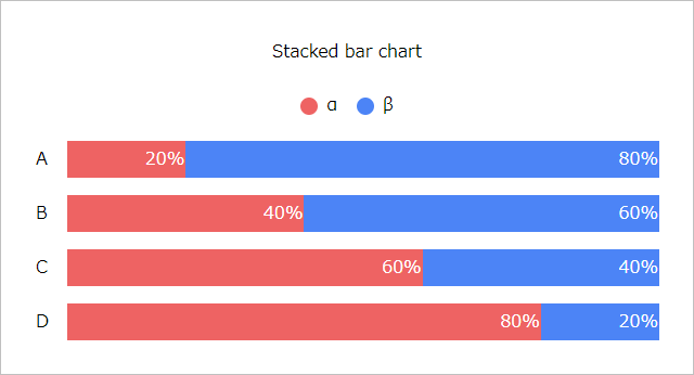
また、table要素のclass属性に .grouped を追加すると、集合棒グラフになります。
<table class="_bar-chart grouped" style="--bar-max: 80;">
<caption>Grouped bar chart</caption>
<thead>
<tr>
<th></th>
<th scope="col" style="--bar-color: var(--red);">α</th>
<th scope="col" style="--bar-color: var(--blue);">β</th>
</tr>
</thead>
<tbody>
<tr>
<th scope="row">A</th>
<td style="--bar-value: 10; --bar-color: var(--red);">10%</td>
<td style="--bar-value: 20; --bar-color: var(--blue);">20%</td>
</tr>
<tr>
<th scope="row">B</th>
<td style="--bar-value: 30; --bar-color: var(--red);">30%</td>
<td style="--bar-value: 40; --bar-color: var(--blue);">40%</td>
</tr>
<tr>
<th scope="row">C</th>
<td style="--bar-value: 50; --bar-color: var(--red);">50%</td>
<td style="--bar-value: 60; --bar-color: var(--blue);">60%</td>
</tr>
<tr>
<th scope="row">D</th>
<td style="--bar-value: 70; --bar-color: var(--red);">70%</td>
<td style="--bar-value: 80; --bar-color: var(--blue);">80%</td>
</tr>
</tbody>
</table>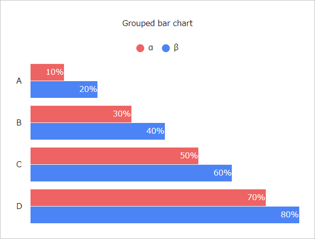
CodePen
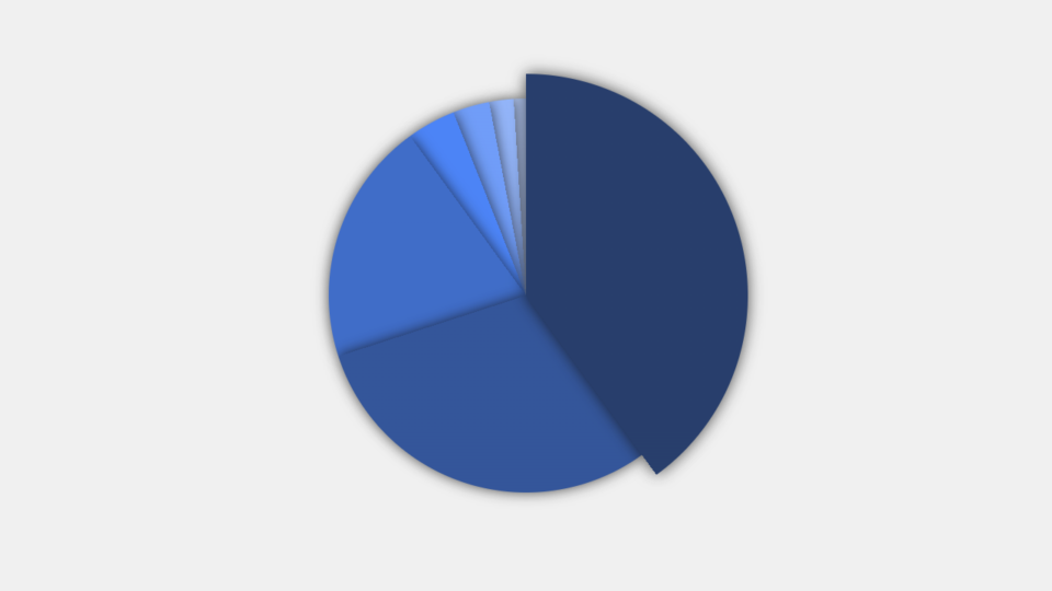
〆
英語で、棒グラフはバーチャート、円グラフはパイチャートと言うみたいです。
関連記事
- CSSアンカーポジショニングでプルダウンメニューを作る方法
 すべてのブラウザで使用可能になった CSSアンカーポジショニング を使用して、リストをプルダウンメニューにする方法を紹介しています。
 - 画像不要!模様をリピートさせた背景画像をCSSだけで作る方法
 CSSのbackgroundプロパティとlinear-gradient()やradial-gradient()を使って、模様を作る方法を紹介してます。コードも多数掲載しており、コピペで使うこともできます。
 - カスタムプロパティ (CSS変数) を使用した調整しやすい余白設定
 CSSのカスタムプロパティ (CSS変数) を使用して、垂直方向の余白を合理的かつ効率的に管理する方法を紹介しています。
 - CSSのコンテナクエリで position: fixed の扱い方が変わった件
 contaier-type プロパティを設定した要素の子孫要素に対して position プロパティを fixed に設定しても absolute として扱われていたはずなのに、いつの間にか fixed として機能するようになっていた件をシェアします。