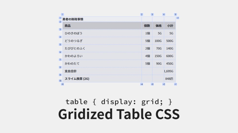
table要素をグリッドで再構築する Gridized Table CSS
table要素 が思った通りに表示されず悩んでいませんか? table要素 は複雑になりがちな情報をまとめるのに最適です。しかし、独特のレンダリングアルゴリズムによって、思った通りに表示されないことが多々あります。そこで今回は、table要素 をスタイリングしやすくするための「Gridized Table CSS (表をグリッド化する CSS)」を紹介します。
table要素 の問題点
table要素 のスタイリングは難しいです。thead要素 や tfoot要素 の有無、tr要素毎 の th要素 の有無、colspan属性 や rowspan属性 の有無など、バリエーションが多岐に渡るため、単一のスタイルでそれらを網羅することは中々できません。
また、冒頭でも述べたとおり、独特のレンダリングアルゴリズムによって描画されることが、スタイリングを難しくしています。そういった問題の解決方法になり得るのが、Gridized Table CSS です。
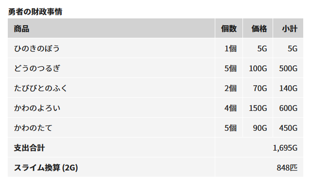
上記の画像のようなレイアウトの設定は、一見簡単そうに見えますが、その実装は難しいです。各列に inline-sizeプロパティ (widthプロパティ) を細かく設定すれば、これに近いことはできますが、内容が変わるたびに調整が必要になります。グリッド化することで、列の幅の調整が必要のないスタイリングができるようになります。
Gridized Table CSS のコード
/**
 * table[class*="__table-gridized__"]
 * > caption
 * > :is(thead, tbody, tfoot) > tr > :is(th, td):nth-child(-n + 8)
 */
[class*="__table-gridized__"] {
  --column-width: auto; /* 列の幅のデフォルト。1fr にすると table-layout: fixed; と同じになる。 */
  --column-width-1: var(--column-width);
  --column-width-2:; /* Null な値の CSS変数 は存在しないかのように扱われる。 */
  --column-width-3:;
  --column-width-4:;
  --column-width-5:;
  --column-width-6:;
  --column-width-7:;
  --column-width-8:;
  display: grid;
    grid:
        auto-flow dense
        /
        var(--column-width-1)
        var(--column-width-2)
        var(--column-width-3)
        var(--column-width-4)
        var(--column-width-5)
        var(--column-width-6)
        var(--column-width-7)
        var(--column-width-8);
  overflow: auto; /* 必要に応じてスクロールバーを表示させる。 */

  &:has(> * > tr > :nth-child(2)) { /* 列の存在を確認してデフォルトの幅を代入する。 */
    --column-width-2: var(--column-width); /* Null でなくなることにより列として認識される。 */
}
  &:has(> * > tr > :nth-child(3)) {
    --column-width-3: var(--column-width);
  }
  &:has(> * > tr > :nth-child(4)) {
    --column-width-4: var(--column-width);
  }
  &:has(> * > tr > :nth-child(5)) {
    --column-width-5: var(--column-width);
  }
  &:has(> * > tr > :nth-child(6)) {
    --column-width-6: var(--column-width);
  }
  &:has(> * > tr > :nth-child(7)) {
    --column-width-7: var(--column-width);
  }
  &:has(> * > tr > :nth-child(8)) {
    --column-width-8: var(--column-width);
  }
  & > caption {
    display: block;
    grid-column: 1 / -1; /* テーブル幅いっぱいにする。 */
    /* order: 1; を追加すると caption-side: bottom; と同じになる。 */
  }
  & > colgroup,
  & > * > col {
    display: none;
  }
  & > :is(thead, tbody, tfoot),
  & > * > tr {
    display: contents;
  }
  & > * > tr > * {
    display: block;

    &:where([rowspan="2"]) { /* rowspan属性 を代替する。 */
      grid-row: span 2;
    }
    &:where([rowspan="3"]) {
      grid-row: span 3;
    }
    &:where([rowspan="4"]) {
      grid-row: span 4;
    }
    &:where([rowspan="5"]) {
      grid-row: span 5;
    }
    &:where([rowspan="6"]) {
      grid-row: span 6;
    }
    &:where([rowspan="7"]) {
      grid-row: span 7;
    }
    &:where([rowspan="8"]) {
      grid-row: span 8;
    }
    &:where([colspan="2"]) { /* colspan属性 を代替する。 */
      grid-column: span 2;
    }
    &:where([colspan="3"]) {
      grid-column: span 3;
    }
    &:where([colspan="4"]) {
      grid-column: span 4;
    }
    &:where([colspan="5"]) {
      grid-column: span 5;
    }
    &:where([colspan="6"]) {
      grid-column: span 6;
    }
    &:where([colspan="7"]) {
      grid-column: span 7;
    }
    &:where([colspan="8"]) {
      grid-column: span 8;
    }
  }
}
これが、Gridized Table CSS の基礎部分です。HTML で <table class="__table-gridized__bordered"> … </table> のように設定すると、表の状態を維持したまま、グリッド化できます。列の幅は最大8列まで設定できるようになっています。9列以上設定したい場合は --column-width-9, --column-width-10, … を適宜追加する必要があります。
あとは、境界線などを追加して体裁を整えれば、普通の表と変わらない見た目になります。
.__table-gridized__bordered {
  border: solid 1px color-mix(in srgb, transparent, currentcolor 50%);
  gap: 1px;
  padding: 1px;

  & > * > tr > * {
    border: solid 1px color-mix(in srgb, transparent, currentcolor 50%);
    padding-block: calc(0.5lh - 0.5em);
    padding-inline: calc(1lh - 1em);
  }
}
/* 上記のコードは次のコードを設定した表と同じように表示されます。 */

/**
 * table.__table-normal__bordered
 * > caption
 * > :is(thead, tbody, tfoot) > tr > :is(th, td)
 */
[class*="__table-normal__"] {
  border-spacing: 0;
  inline-size: 100%;
}
.__table-normal__bordered {
  border: solid 1px color-mix(in srgb, transparent, currentcolor 50%);
  border-spacing: 1px;

  & > * > tr > * {
    border: solid 1px color-mix(in srgb, transparent, currentcolor 50%);
    padding-block: calc(0.5lh - 0.5em);
    padding-inline: calc(1lh - 1em);
  }
}
注意点としては、border-spacingプロパティ や border-collapseプロパティ のような、table要素専用 のプロパティが使用できなくなるので、これらを設定した場合と同様の見た目にしたい場合は、それなりに工夫する必要があります。
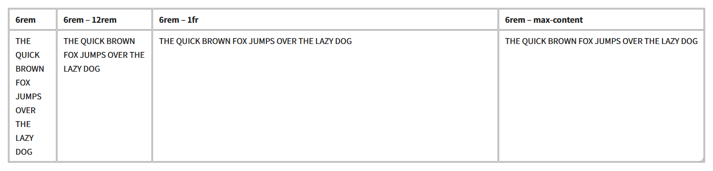
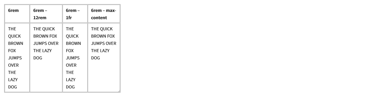
グリッドの列の幅を設定する
グリッド化することの最大のメリットである、列の幅を設定していきます。設定の仕方は2つあります。1つは専用のクラスを用意して設定する方法です。
<style>
.__table-gridized__resizable {
  --column-width-1: 6rem; /* 列の幅を 6rem に設定。 */
  --column-width-2: minmax(6rem, 12rem); /* 列の最小幅を 6rem、最大幅を 12rem に設定。 */
  --column-width-3: minmax(6rem, 1fr); /* 列の最小幅を 6rem、最大幅は余ったスペース分広げる。 */
  --column-width-4: minmax(6rem, max-content); /* 列の最小幅を 6rem、最大幅は内容に合わせる。 */
  resize: both;
}
</style>
…
<table class="__table-gridized__bordered __table-gridized__resizable">
  …
</table>もう1つの方法は、table要素 に style属性 を追加する方法です。
<style>
.__table-gridized__resizable {
  resize: both;
}
</style>
…
<table class="__table-gridized__bordered __table-gridized__resizable" style="--column-width-1: 6rem; --column-width-2: minmax(6rem, 12rem); --column-width-3: minmax(6rem, 1fr); --column-width-4: minmax(6rem, max-content);">
  …
</table>
繰り返し同じ設定をする場合は前者を、表の内容に応じて柔軟に設定したい場合は後者を選ぶといいでしょう。
CodePen
まとめ
Gridized Table CSS を使用することで、table要素 のセマンティックなマークアップをそのままに、グリッド化することができます。colspan属性 や rowspan属性 も問題なく使えるので、様々な表に応用しやすいと思います。table要素 が思った通りに表示されず悩んだら、Gridized Table CSS の使用を検討してみてください。
〆
table要素 のレンダリングアルゴリズムが改善されれば、こんなコードを書かずに済むのですが。
関連記事
- CSSでチェックボックスとラジオボタンのデザインを変更する方法
 ブラウザ毎に異なるデザインでCSSによるデザインが不可能なチェックボックスとラジオボタンに、独自のデザインを設定する方法をご紹介します。
 - HTMLとCSSのメタ・フレームワーク「XSA」を公開しました
 「限界突破した style属性」を意味する「XSA」というメタ・フレームワークを作りました。Tailwind CSS にアレルギーがある方の処方箋になるかもしれません。是非、お試しください。
 - HTMLとCSSで切り替えられるタブの作り方
 コピペしたらすぐに使える、HTMLとCSSでタブ切り替えを実装する方法を紹介しています。ラジオボタン、ラベル、兄弟セレクタ、グリッドレイアウトを組み合わせた作り方です。
 - WordPressにコピペで実装するパンくずリストのPHPコード
 WordPressテーマのfunctions.phpにコピペするだけで使えるパンくずリストのPHPコードを紹介しています。もちろん、Microdataによる構造化データにも対応しています。