コピペから始めるウェブページの見出しデザイン
ウェブページを構成する要素の中で、最も重要と言えるのが見出しです。見出しは、その後に続く情報がどういった内容なのかを端的に示すものだからです。
見出しを目立つようデザインすることは、必要な情報を素早く見つける助けとなります。そこで、今回は見出しをデザインする上で重要だと思うことを、コピペできるコードとともに紹介します。
見出しは目立たせる必要がありますが、目立つかどうかは見出し以外の要素が、どのようにデザインされているかにも左右されます。
例えば、色とりどりな画像を多く使っているような場合、それらの画像以上に目立つよう見出しをデザインする必要があります。
それとは逆に、構成要素が控えめの色・大きさでデザインされている場合、見出しの文字を大きくするだけで十分に目立つ場合もあります。
また、ウェブページ全体が落ち着いたデザインなのに、見出しを過剰にデザインしてしまうと、全体のバランスを大きく損なってしまいます。
そのため、見出し以外の構成要素にも目を向けてデザインする必要があるでしょう。
デザインは構造に左右される
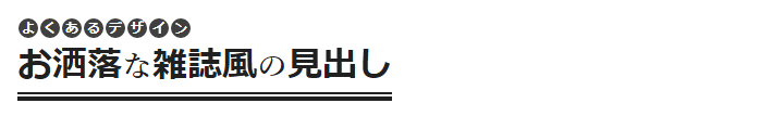
上の画像のような、雑誌などでよく見る見出しをウェブページで再現するためには、見出しの構造も複雑になってしまいます。
<h2 class="heading">
  <small class="upper"><!--
    --><span class="letter">よ</span><!--
    --><span class="letter">く</span><!--
    --><span class="letter">あ</span><!--
    --><span class="letter">る</span><!--
    --><span class="letter">デ</span><!--
    --><span class="letter">ザ</span><!--
    --><span class="letter">イ</span><!--
    --><span class="letter">ン</span><!--
  --></small>
  <br />
  <span class="lower"><!--
    --><span class="word">お洒落</span><!--
    --><span class="particle">な</span><!--
    --><span class="word">雑誌風</span><!--
    --><span class="particle">の</span><!--
    --><span class="word">見出し</span><!--
  --></span>
</h2>.heading {
font-size: 1em;
font-weight: inherit;
line-height: 1.5;
}
.heading .upper {
display: inline-flex;
flex-wrap: wrap;
font-size: 0.75em;
}
.heading .upper .letter {
background: #404040;
color: #fff;
border-radius: 50%;
display: block;
line-height: 1.5;
margin: 1px;
text-align: center;
width: 1.5em;
height: 1.5em;
}
.heading .lower {
display: inline-block;
}
.heading .lower:after {
background: currentcolor;
box-shadow:
0 -0.125em currentcolor,
0 -0.375em currentcolor;
content: "";
display: block;
height: 0.125em;
margin-top: 0.375em;
}
.heading .lower .word {
font-family: sans-serif;
font-size: 2em;
}
.heading .lower .particle {
font-family: serif;
font-size: 1.75em;
}構造が複雑な見出しは、設定するのが面倒だったり、使える場所が限定的で使い回せないといったデメリットがあります。そのため、見出しを多く使用したり、HTMLやCSSの知識があまりない人が書くブログ記事などでは、見出しの構造はシンプルな方が良いでしょう。
<h2 class="heading">シンプルな見出し</h2>結果として、良く見る見出しのデザインもシンプルなものが多い傾向にあります。
見出しデザインの3つの設定
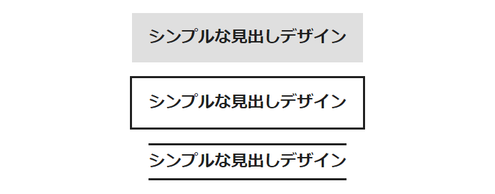
シンプルな見出しのデザインは、背景の設定、ボーダーの設定、擬似要素の設定、の3つのうち、1つだけか複数組み合わせて作られています。
背景を設定した見出しデザイン
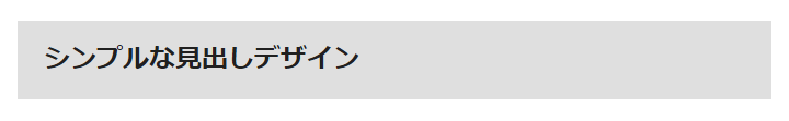
<h2 class="__heading__background">シンプルな見出しデザイン</h2>.__heading__background {
background-color: rgba(128, 128, 128, 0.25);
line-height: 1.5;
padding: 0.75em 1em;
}良く見る見出しデザインの1つです。単純に背景色を設定するだけですが、行間 (line-height) と内側の余白 (padding) の取り方で出来栄えが変わってきます。
上記のコードの場合、表示される文字列の行間は0.5文字分、文字列の前後左右は行間の倍の1文字分の余白を取られています。
背景色によっては文字が見えにくくなるので、別途、文字色 (color) や影 (text-shadow) の設定が必要になりますが、上記のコードの場合、灰色をメインカラーとするウェブページ以外で汎用的に使用できます。
背景色を単色ではなく、画像やグラデーション (background-image) を設定することで、より目立つ見出しになります。
ボーダーを設定した見出しデザイン
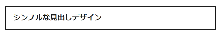
<h2 class="__heading__border">シンプルな見出しデザイン</h2>[class*="__heading__border"] {
border: solid 0.125em;
padding: 0.75em 1em;
}これも良く見る見出しデザインの1つです。背景の設定と同様、行間 (line-height) と内側の余白 (padding) の取り方で出来栄えが変わってきます。
ボーダーの場合、上下のみ設定する、上下左右のうちいずれか1つだけ設定する、といった複数のバリエーションが作れ、ボーダーの幅や色を揃えると統一感も生まれます。
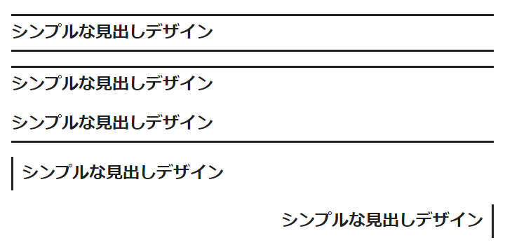
<h2 class="__heading__border-parallel">シンプルな見出しデザイン</h2>
<h2 class="__heading__border-top">シンプルな見出しデザイン</h2>
<h2 class="__heading__border-bottom">シンプルな見出しデザイン</h2>
<h2 class="__heading__border-left">シンプルな見出しデザイン</h2>
<h2 class="__heading__border-right">シンプルな見出しデザイン</h2>[class*="__heading__border-parallel"] {
border-width: 0.125em 0;
padding: 0.25em 0;
}
[class*="__heading__border-top"] {
border-width: 0.125em 0 0;
padding: 0.25em 0 0;
}
[class*="__heading__border-bottom"] {
border-width: 0 0 0.125em;
padding: 0 0 0.25em;
}
[class*="__heading__border-left"] {
border-width: 0 0 0 0.125em;
padding: 0.25em 0 0.25em 0.5em;
text-align: left;
}
[class*="__heading__border-right"] {
border-width: 0 0.125em 0 0;
padding: 0.25em 0.5em 0.25em 0;
text-align: right;
}ボーダーの設定は、スタイル (border-style)、幅 (border-width)、色 (border-color)、画像 (border-image) と、多岐にわたるため、他では見ない見出しデザインも作りやすいです。
擬似要素を設定した見出しデザイン
背景とボーダーの設定だけでも、様々な見出しデザインが作れますが、更にワンポイント追加したい場合や、背景とボーダーの設定だけでは実現できないデザインには、擬似要素を使用します。
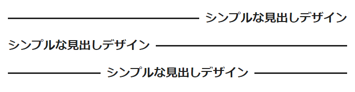
<h2 class="__heading__flex-before">シンプルな見出しデザイン</h2>
<h2 class="__heading__flex-after">シンプルな見出しデザイン</h2>
<h2 class="__heading__flex-both">シンプルな見出しデザイン</h2>[class*="__heading__flex-"] {
display: flex;
}
.__heading__flex-before:before,
.__heading__flex-after:after,
.__heading__flex-both:before,
.__heading__flex-both:after {
border-top: solid 0.125em;
content: "";
display: block;
flex: 1 0 0.5em;
align-self: center;
}
.__heading__flex-before:before,
.__heading__flex-both:before {
margin-inline-end: 0.5em;
}
.__heading__flex-after:after,
.__heading__flex-both:after {
margin-inline-start: 0.5em;
}上記のコードでは、ボーダーの設定ではできない、文字列の左右にラインがあるデザインを実現しています。
この左右にラインがあるデザインをボーダーの設定と組み合わせると、文字列部分のみ色が異なるボーダーが作れます。
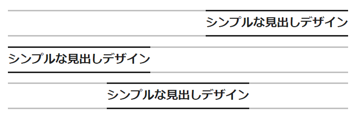
<h2 class="__heading__border-parallel-flex-before">シンプルな見出しデザイン</h2>
<h2 class="__heading__border-parallel-flex-after">シンプルな見出しデザイン</h2>
<h2 class="__heading__border-parallel-flex-both">シンプルな見出しデザイン</h2>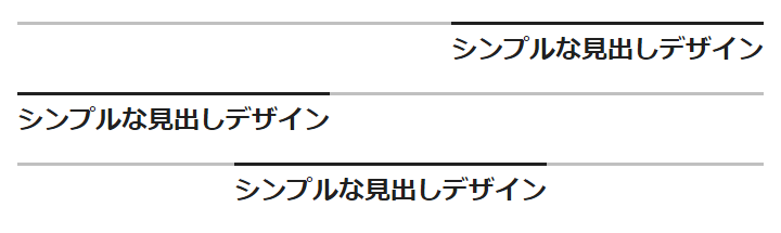
<h2 class="__heading__border-top-flex-before">シンプルな見出しデザイン</h2>
<h2 class="__heading__border-top-flex-after">シンプルな見出しデザイン</h2>
<h2 class="__heading__border-top-flex-both">シンプルな見出しデザイン</h2>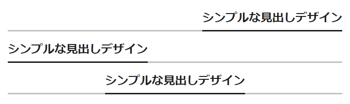
<h2 class="__heading__border-bottom-flex-before">シンプルな見出しデザイン</h2>
<h2 class="__heading__border-bottom-flex-after">シンプルな見出しデザイン</h2>
<h2 class="__heading__border-bottom-flex-both">シンプルな見出しデザイン</h2>/* ボーダーの設定 */
[class*="__heading__border"] {
  border: solid 0.125em;
  padding: 0.75em 1em;
}
[class*="__heading__border-parallel"] {
  border-width: 0.125em 0;
  padding: 0.25em 0;
}
[class*="__heading__border-top"] {
  border-width: 0.125em 0 0;
  padding: 0.25em 0 0;
}
[class*="__heading__border-bottom"] {
  border-width: 0 0 0.125em;
  padding: 0 0 0.25em;
}
[class*="__heading__border-left"] {
  border-width: 0 0 0 0.125em;
  padding: 0.25em 0 0.25em 0.5em;
  text-align: left;
}
[class*="__heading__border-right"] {
  border-width: 0 0.125em 0 0;
  padding: 0.25em 0.5em 0.25em 0;
  text-align: right;
}
/* 追加する疑似要素の設定 */
[class*="__heading__border-parallel-flex-"],
[class*="__heading__border-top-flex-"],
[class*="__heading__border-bottom-flex-"] {
display: flex;
}
.__heading__border-parallel-flex-before:before,
.__heading__border-parallel-flex-after:after,
.__heading__border-parallel-flex-both:before,
.__heading__border-parallel-flex-both:after,
.__heading__border-top-flex-before:before,
.__heading__border-top-flex-after:after,
.__heading__border-top-flex-both:before,
.__heading__border-top-flex-both:after {
border-top: solid 0.125em #c0c0c0;
content: "";
display: block;
flex: 1 0 0;
margin-top: -0.375em;
}
.__heading__border-parallel-flex-before:before,
.__heading__border-parallel-flex-after:after,
.__heading__border-parallel-flex-both:before,
.__heading__border-parallel-flex-both:after,
.__heading__border-bottom-flex-before:before,
.__heading__border-bottom-flex-after:after,
.__heading__border-bottom-flex-both:before,
.__heading__border-bottom-flex-both:after {
border-bottom: solid 0.125em #c0c0c0;
content: "";
display: block;
flex: 1 0 0;
margin-bottom: -0.375em;
}fit-contentを使用した中央配置
文字揃え (text-align) ではなく、見出しそのものを中央に配置することで、横幅いっぱいに広がった見出しとは違った印象になります。
<h2 class="__heading__background __heading__centered">シンプルな見出しデザイン</h2>
<h2 class="__heading__border __heading__centered">シンプルな見出しデザイン</h2>
<h2 class="__heading__border-parallel __heading__centered">シンプルな見出しデザイン</h2>.__heading__centered {
margin-right: auto;
margin-left: auto;
width: -webkit-fit-content;
width: -moz-fit-content;
width: fit-content;
}〆
紹介したコードをコピペするだけですぐ使えると思います。というのも、フォント (font-family)、文字サイズ (font-size)、マージン (margin) などの設定を一切しておらず、コピペ先のCSS任せだからです。
なので、これらの設定は独自に行ってください。お粗末様でした。
関連記事
- table要素をグリッドで再構築する Gridized Table CSS
 table要素 のスタイリングで困っていませんか?独特のレンダリングアルゴリズムを持つ table要素 をスタイリングしやすくするために、display: grid; でグリッド化する方法を紹介しています。
 - WordPressにコピペで実装するパンくずリストのPHPコード
 WordPressテーマのfunctions.phpにコピペするだけで使えるパンくずリストのPHPコードを紹介しています。もちろん、Microdataによる構造化データにも対応しています。
 - NULLなCSS変数によるCSSグリッドレイアウト
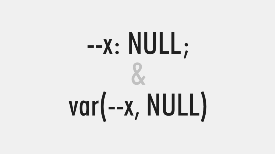 CSS変数 (カスタムプロパティ) に NULL (値なし) を設定して、柔軟性と拡張性のあるCSSグリッドレイアウトを実現する方法を紹介しています。
 - CSS変数を利用したショートハンドプロパティもどき
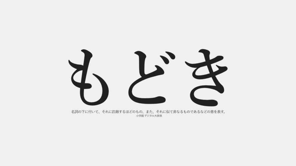 CSS変数 (カスタムプロパティ) を使用して、ショートハンドプロパティではないプロパティを、ショートハンドプロパティのように扱う、「ショートハンドプロパティもどき」について説明しています。